This is the most accurate world map to date
It takes some getting used to, but this is a map of the world. AuthaGraph is the most accurate map of the Earth currently available. At least when it comes to the proportions and size of land masses.
It’s a puzzle with latitude and longitude, because those waves flow through the image. The map of the world as we know it doesn’t have that last problem, the lines are almost straight there. But again, superficial proportions are lost.
Map makers have been struggling with the same problem for centuries. They are trying to turn something round like a globe into something flat like a map of the world. Just imagine if you stretched a string around the globe, just across the middle. If all goes well, the thread will stretch along the equator and thus over Indonesia, Kenya and, of course, Ecuador (named after the equator).
From something round to something flat
Cut the thread and stretch a new thread higher on the globe. For example, at 50 degrees north latitude, along Russia, Canada and Belgium. Also cut that chain and you will have a much shorter chain than the first. I made a smaller circle out of it. If you had to plot the countries on these threads on a rectangular map, you would have to shorten the longest chain and extend the shortest chain a bit. And the countries that lie along it too. This is the basis of the classic Mercator projection.
Thus the dimensions of the continents are incorrect. Everything on the equator is completely contracting, and everything at 50 degrees north latitude is completely expanding.
Suddenly the continent of Africa looks twice as small as Russia. In fact, it is the other way around: Russia is almost twice the size of Africa. Just think: Russia has an area of 17 million square kilometers, and the continent of Africa covers more than 30.3 million square kilometers.
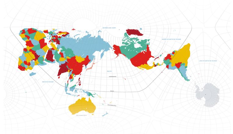
The creator of the Japanese AuthaGraph, Hajime Narukawa, is not a cartographer, but an architect. He was studying in the Netherlands at the Berlage Institute when he decided to solve a world map problem. He dealt with the matter mathematically, dividing the globe into 96 triangles, and calculating all the proportions. Although the proportions are still not 100% correct, his map has become more realistic. Moreover, Antarctica is well included on the Japanese/Dutch map. Most projections show Antarctica either with a white squiggly line at the bottom or not at all.
Our world map tells a story
Is that reason enough to throw the old map in the trash? Professor Henk van Houtome doesn’t need that, but more interest in multiple perspectives on our world would be healthy. Van Houtome teaches geopolitics and political geography at Radboud University. “The map is a story, just like the text. So it is remarkable that we have been telling almost the same story for centuries: the colonial Mercator map, with a distorted picture of America, Europe and Russia, the North and South poles much larger, and Europe as the colonial power of the world. Time, standard In the middle Perhaps other projections of the world contribute to the idea that there is no single, overarching story.
Van Houtum finds the AuthaGraph “very interesting,” but he’s not a fan of maps of regional boundaries such as countries or continents. “This should not be the sole or dominant window on the world into our education, politics and media. AuthaGraph still also pretends that the world can be reduced to a world of territories only. “Not to mention the world of people and their relations across borders. It nurtures thinking in terms of national differences. It pretends that countries are homogeneous parts, and makes other influences, such as diversity and international dynamics, an exception rather than an integral part of it. It is time for a more humane and holistic vision.” for world maps.
This amounts to an alternative way of looking at the traditional map. The graphics and stats will then be given a more prominent place.
But the publisher of maps and charts Postales has little need for alternative viewpoints or perspectives. According to the spokesperson, Bosatlas will soon not include AuthaGraph either. The geographical degree grid of latitude and longitude is distorted, and the publisher considers it educationally important to provide insight into what lies at the geographical latitude or longitude. “It has also become a buzz in recent years to classify only real projections for the region as ‘good’.” Often reference is made to the Mercator projection, which shows much larger areas the farther from the equator. This is usually associated with the rich West, which deliberately wants to It makes poor countries appear smaller and less important, as in the continent of Africa.But in our atlases, the Mercator projection is not used.
The Winkel-Tripel projection is currently used in the Bosatlas, which was designed by the German Oswald Winkel a century ago. This is called dropping the cylinder. The curvature of the equator towards south and north has been included in the image, so that distortion is prevented. The Asia-Alaska tip is once again under pressure somewhat due to the Winkle-Triple outlook. Bosatlas uses this map as a reasonable compromise between area, angle, and distance accuracy.
Incidentally, Pusatlas’ reasoning in rejecting the AuthaGraph is not purely didactic. Hajime Narukawa’s sports accounts are not free to access, but are protected by rights. Officially, AuthaGraph is a copyrighted design. Therefore, projection cannot be integrated into georeferencing software.
Whether design will take educational forms in our schools depends, according to Pusatlas, on the needs of Dutch educators. “In our online atlas environment, we cover a number of different map projections. These differences are of particular interest to secondary school students in pre-university education. If this proves to be a useful addition in a future edition, according to geography teachers, this projection could be included on that site.
So it will be some time before every student can see that Australia is three times larger than Greenland.

“Travel enthusiast. Alcohol lover. Friendly entrepreneur. Coffeeaholic. Award-winning writer.”